Algorithmic Arts
virgin wines project
Data made
interactive.
Data made interactive.
Overview & brief:
As part of a collaborative project, we designed an interactive visualisation using p5.js to explore drought patterns across Europe.
Using a pre-defined dataset, we transformed complex environmental data into a creative, code-driven experience that highlights the impact of climate change.
services
CREATIVE COMPUTING HTML /CSS/
Javascript & P5.JS
MIDI CONTROLS Research
VISUAL DATA
Prototyping
timelinE
JAN '25 (1-2 weeks)

competitior research:
Research
competitior research:
Research
findings
findings
Focusing on developing design and functionality ideas, I researched into interactive visualisations from online competitors. From this, I identified key interaction categories (outlined below) and mapped them to potential MIDI controls to enhance user interaction.
- Visual appearance
- Motion & behaviour
- Content & display
How might we use coding languages and MIDI controls to create an interactive data visualisation?
How might we use coding languages and MIDI controls to create an interactive data visualisation?
developing a prototype:
Creative
developing a prototype:
Creative
computing
computing.
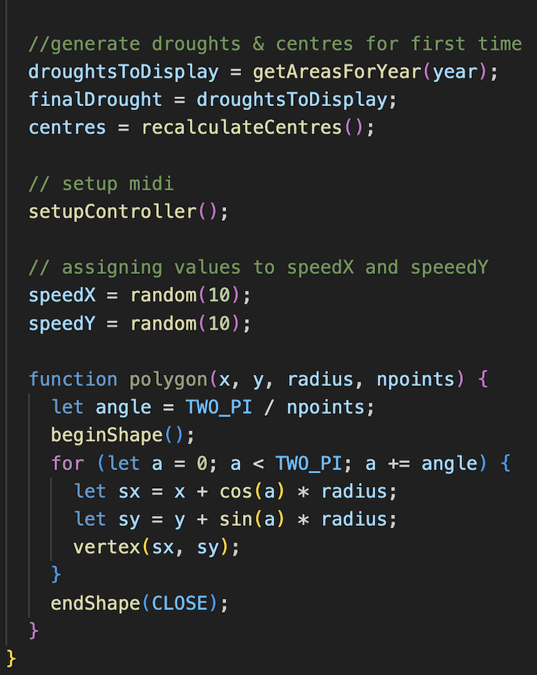
We used p5.js and JavaScript to create responsive visuals controlled by MIDI input. Key functions like beginShape() and vertex() let us draw polygons with dynamic point counts, while conditional logic (if, switch) mapped controller values to colour, speed, and visibility.
We also used vector math (p5.Vector, normalize()) to manage smooth movement and ensure shapes responded fluidly to input.

Interaction and user engagement:
MIDI
Interaction and user engagement:
MIDI
controls.
controls.
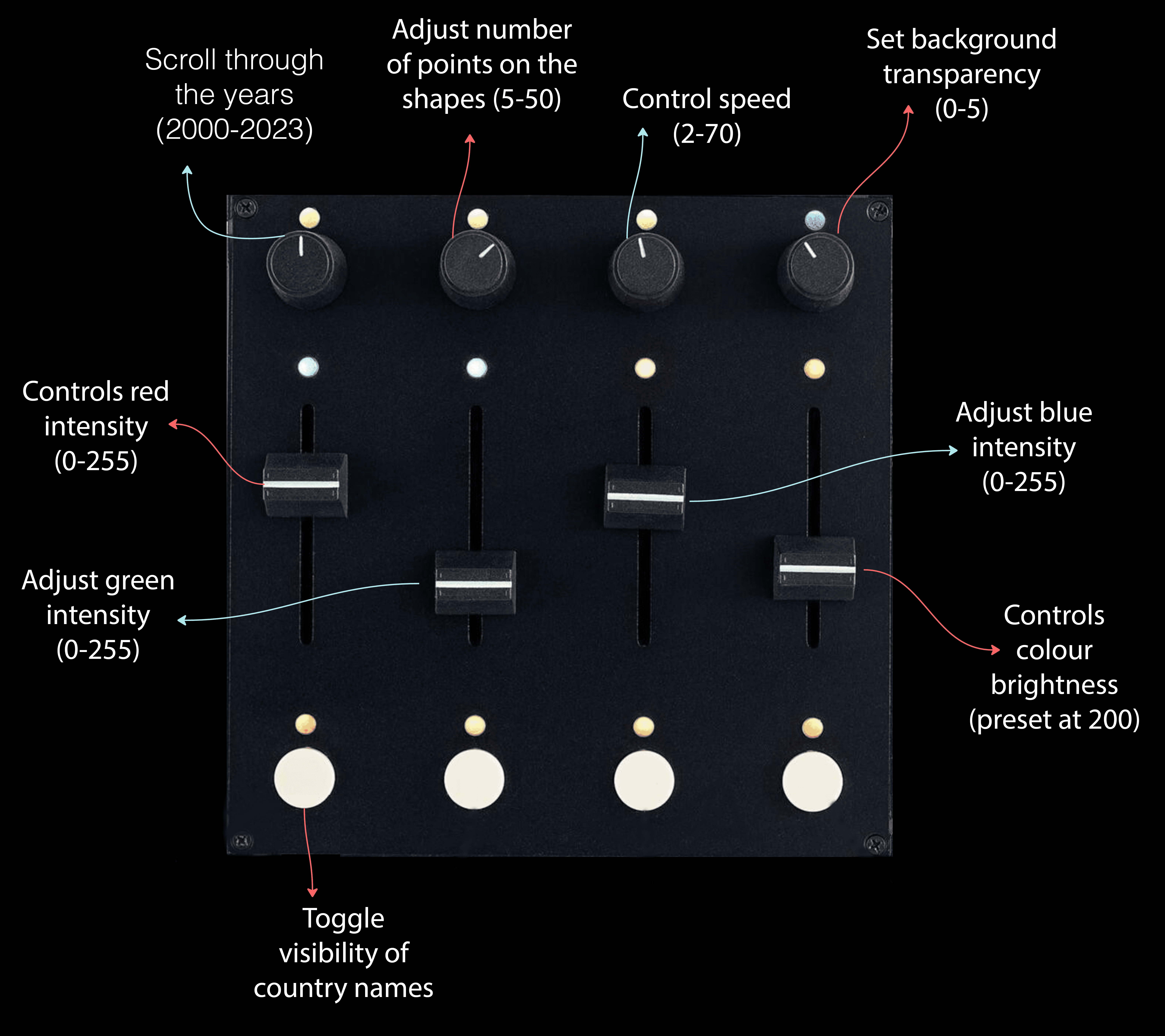
We used MIDI hardware to create an interactive visual experience, combining creative coding with physical input controls.
Using p5.js and webmidi.js, each MIDI input; knobs, sliders, and buttons, was mapped to visual parameters like colour, shape, and animation speed.
This setup made data interaction tactile and intuitive. Users could explore visual changes in real time, enhancing both usability and creative freedom.
We used MIDI hardware to create an interactive visual experience, combining creative coding with physical input controls.
Using p5.js and webmidi.js, each MIDI input—knobs, sliders, and buttons—was mapped to visual parameters like color, shape, and animation speed.
This setup made data interaction tactile and intuitive. Users could explore visual changes in real time, enhancing both usability and creative freedom.
We used MIDI hardware to create an interactive visual experience, combining creative coding with physical input controls.
Using p5.js and webmidi.js, each MIDI input; knobs, sliders, and buttons, was mapped to visual parameters like colour, shape, and animation speed.
This setup made data interaction tactile and intuitive. Users could explore visual changes in real time, enhancing both usability and creative freedom.
Immersive Visualisation and Simulation Lab:
Immersive
immersive Visualisation and Simulation Lab:
Immersive
experience
experience.
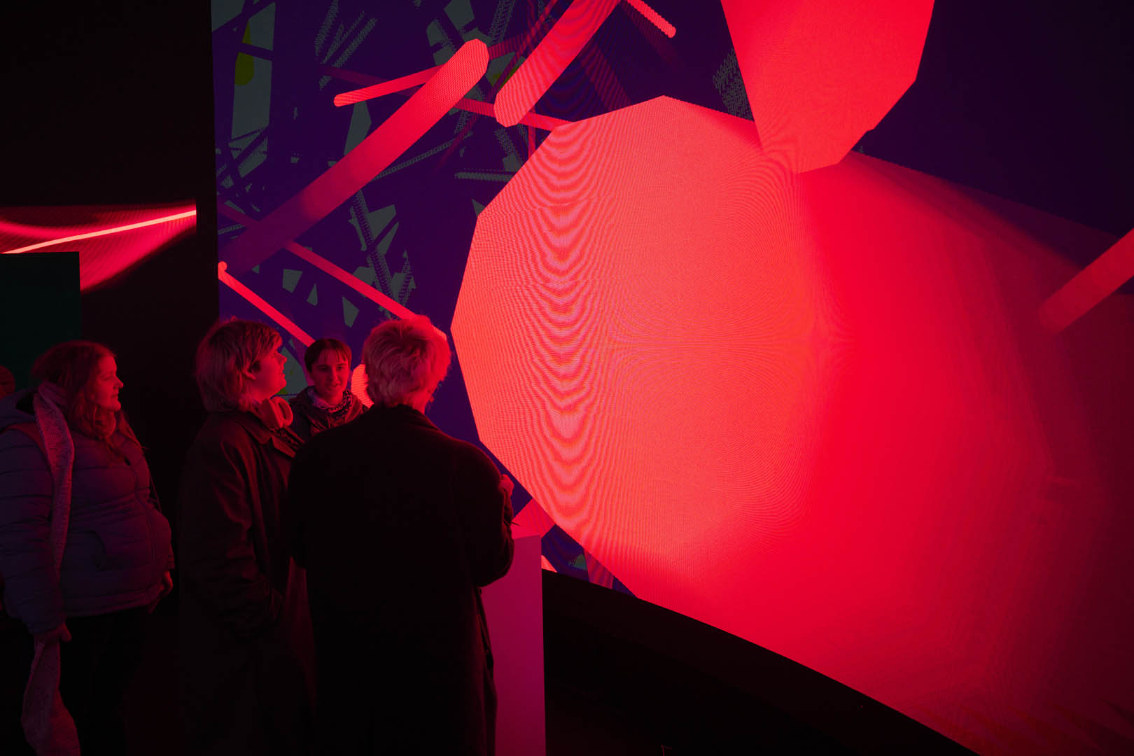
Our interactive data visualisation was designed to engage users through real-time input, dynamic visuals, and responsive feedback. This transformed climate data into an experience that felt both playful and thought-provoking.
We had the exciting opportunity to exhibit the final piece at the Immersive Visualisation and Simulation Lab (IVSL), a cutting-edge space for digital experimentation and audience engagement. These are the IVSL features:
- 4D Holosys Volumetric Capture System
- 10m x 4m 360° LED volume immersive sound
- Programmable AI or audience interaction
- An extensive Diguise-based Virtual Production Studio.
Displaying our project in such an advanced environment elevated the experience for both creators and viewers, allowing the visualisation to be explored on a much larger, more immersive scale.
key takeaway:
Future
key takeaway:
Future
strategies
strategies
This project was both successful and insightful, enhancing my understanding of coding for interactive data visualisation. I was proud of the final outcome and especially valued the chance to exhibit it with my team at the Immersive Visualisation and Simulation Lab (IVSL), where it was well-received by staff, peers, and the public.
A key takeaway was learning how to turn repetitive datasets into engaging, customisable experiences.
Given more time, I would like to expand the project by adapting the MIDI controls to keyboard input. This will improve usability and accessibility for users who may not have access to MIDI hardware.
This project was both successful and insightful, enhancing my understanding of coding for interactive data visualisation.. I was proud of the final outcome and especially valued the chance to exhibit it with my team at the Immersive Visualisation and Simulation Lab (IVSL), where it was well-received by staff, peers, and the public.
A key takeaway was learning how to turn repetitive datasets into engaging, customisable experiences.
Given more time, I would like to expand the project by adapting the MIDI controls to keyboard input. This will enhance usability and accessibility for users who may not have access to MIDI hardware.